Geometry in Medieval Design
The work of medieval artists, artisans and architects show a fascination for beauty that went further than merely striving for what was pleasing to the eye. Beauty was a way to express ideas of religious and philosophical nature. Medieval art is a language rich with symbols and meaning.
A tool for craftsmen and philosophers
We know that geometric drawing was used in the design of the architecture of cathedrals and the composition of religious art as a way to ensure harmonic proportions and a coherent structure. In the 1480´s the goldsmith Hanns Schmuttermayer published a handbook for design, “Fialenbüchlein”, demonstrating the use of geometry to establish the proportions of architectural details (among other things goldsmiths made reliquaries in the shape of miniature buildings). In the introduction we learn that he wrote the book for the benefit of:
“all masters and journeymen who use this high and liberal art of geometry”
-So that their:
“feeling, speculation, and imagining can be better subjected, after memorization, to the true basis of measured work, and (be allowed) to take root”.
(from “Gothic Design Techniques” Lon R. Shelby 1977)
From this it is evident that geometry was used to formalize those intuitive thought processes that drive the creative mind, and subject them to a logic structure. Schmuttermayer states that there are certain rules for how geometry should be used to define all parts of a design according to a basic system of proportion so that the work will relate to the same principles in all its scales. In a way this is reminiscent to our modern concept of fractal geometry.
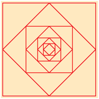
The geometric rose of inscribed and rotated squares, Ad Quadratrum.
Geometric drawing as a method for design and construction was not an obscure art practiced only by a few initiated masters. It is possible to learn the art of geometric drawing simply by observing it being performed. One does not need to be literate or to know advanced mathematics to be able to understand the principles of geometric design or to use it as a tool for construction and design. Even though the basic principles were simple to understand and easy to use, also God was thought to use geometry in his work. In medieval iconography, the Creation of the world is manifested with a tool for design: a pair of compasses is used to divide the heavens from the earth and the water from the dry land.
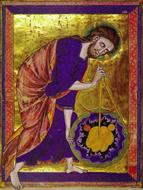
When he established the heavens I was there: when he set a compass upon the face of the deep.
Proverbs 8:27
The Poet Geoffrey of Vinsauf wrote about the composition of literary work, using an image of a craftsman who uses a compass to lay out his work in advance.
“Let the mind´s interior compass first circle the whole extent of the material. Let a definite order chart in advance at what point the pen will take up its course. As a prudent workman, construct the whole fabric within the mind´s citadel; let it exist in the mind before it is on the lips”
Both Schmuttermayer and Vinsauf stress the imporance of memorization in the process of creative work. The Art of Memory, Ars Memoriae, were since classical times methods for bringing a structure to ideas and to train the memory, but they were also used as an aid in composition and creative work. To help memorization, imagined places were staged with associative images. Not only imagined architecture, but also abstract graphic images such as geometric constructions were used in such systems for memorization. A design based on geometry is indeed well suited for memorization. A craftsman would have been greatly helped to have access to a mental catalogue of completed designs that were instantly at hand and adjustable for any given situation.
Symbolic meaning
It was more to geometric drawing than simply being a handy method for establishing pleasing proportions and a way to structure the creative process. Geometry was also charged with symbolic meaning. Religious ideas and beliefs were expressed with symbols as much as with words. Regardless of the degree of piety of the individual craftsman, he lived in a world where geometry was an accepted language for core concepts of what was real, right and righteous. The contemporary scholar of architectural history Nigel Hiscock observes that “the search for inner meaning of things was a medieval habit.” (The Symbol at Your Door, 2007). Not every craftsman had to be a philosopher or a mystic, his work would still be influenced by commonly shared ideas of the period.
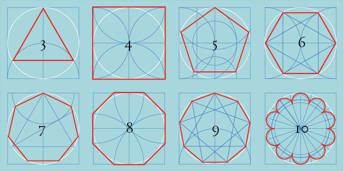
3: Holy Trinity, 4: Stability, the Evangelists, the cornerstone of the Temple, 5: The wounds of Christ, the quintessential,
protection, 6: The days of work in creation, perfection, 7: Wisdom, a completed cycle, the seven sacraments,
the seven virtues, 8: The new beginning, baptism, resurrection, martyrdom,
9: Thrice Holy, the hierarchy of angels, 10: The universe, the Commandments.
The square was a commonly used figure in symbolic imagery with its incorruptible nature. Augustinus explains the proportions of the Ark as having deeply symbolic meaning:
That this ark is made of beams formed in a square, for a square stands firm on any side. That the length is six times the breadth, and ten times the height, like a human body, to show that Christ appeared in human body. That the breadth reaches to fifty cubits. That it is three hundrd cubits long, to make up six times fifty. That it is thirty cubits high, a tenth part of the length.
Contra Faustum XII.14.
Citation from The Symbol at Your Door, Nigel Hiscock, Ashgate 2007
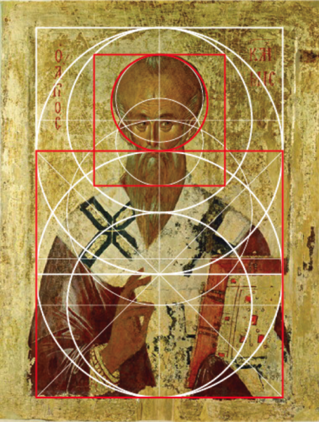
The symbolic meaning of geometric shapes meant they could be used as parables for discussions in various philosophical topics. Clemens of Alexandria said: “Righteousness is quadrangular” (in: Stromateis VI.12. citation from The Symbol at Your Door, N Hiscock, Ashgate 2007) The illustration below show a geometric overlay (of my own making) over an Icon of Clemens of Alexandria as an example of how geometry could have been used in the composition of a work of religious art.
In the 13th century allegorical poem Roman de la Rose the nature of God is described by a quote from the Greek philosopher Empedocles: The nature of God is a circle of which the center is everywhere and the circumference is nowhere.
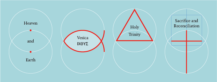
Two circles drawn so that their circumference pass through the middle of the other, is an important device in geometric drawing. It is also an image that combines at least five central themes of Christian religion.
-The two circles can signify the Lord´s Dominion of Heaven and Earth or Christ´s double nature as God and Man.
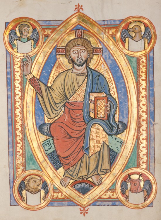
-The almond shape that is formed in the zone where the circles overlap is know a Vesica. This is the shape of the halo around Christ in Majesty on the Throne of Heaven and sometimes also the halo around Mary in her aspect of the the Celestial Virgin.
-The early Christians used the fish as a secret sign. The greek word for fish is Ichtys or ΙΧΘΥΣ: an acronym for Iesous Xristos Theou Yios Soter (Jesus Christ, God´s Son Savior).
-Two circles making a vesica is also how an equilateral triangle is constructed. The vesica can therefore be understood as the prerequisite for the Holy Trinity.
-The two circles and the vesica is also the device to draw two lines that meet in a perfect right angle, which is naturally also the sign of the cross.
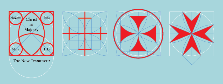
The combined circle and square was a commonly used in composition of artwork and also formed the basis for important religious emblems.
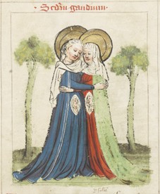
The illumination below of he meeting between Mary and Elisabeth, both pregnant with child (Speculum Humanae Salvationis from 1427 (hosted by Manuscript Miniatures). Jesus and John the Baptist are revealed as fetuses inside their mother´s vesica shaped wombs. It is therefore clear that the obvious generative symbolic meaning of the vesica was recognized in the medieval period.
Below an image of Christ in Majesty seated upon the Throne of Heaven, from the Codex Bruchsal (a manuscript from about AD 1220 in the Badische Landesbibliothek, Germany)
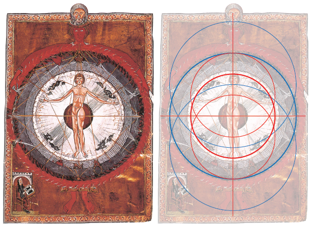
Below is a geometric analysis of a 12th century illumination depicting the “Universal Man” (from Hildegard’s Liber Divinorum Operum, AD 1165). It shows the macrocosm and microcosm explained with the help of meaningful geometry in the composition of the image. The width and height of the composition has the proportion of two interlocked circles (that may be a symbol of The Lord´s Dominion). The same circle also marks the circumference of the heavenly sphere that surrounds the man. Drawing another set of interlocked circles inside the heavenly sphere gives a circle whose diameter gives the height of the Universal Man. The composition is thus made to communicate the same meaning as the theme of the image.
Geometric analysis
The use of geometry in medieval art has not been undisputed among modern day scholars. At times attempts to unlock the secret or forgotten methods of the old masters did more to muddy the waters than present credible conclusions. Some analysis is based on documentation that is less than exact or is allowed to grow exceedingly complicated, becoming more like cob webs of lines and arcs than clear constructions. If a structure is allowed to grow complex enough, if layer upon layer is added, it is in the end possible to prove that an old phone booth in fact is an instrument for astronomical observations. When performing geometrical analysis it is important to keep in mind what the intentions of the originators may have been and wether the geometry may actually be of help in production. For the medieval craftsman or artist the use of geometry in design was a way to structure ideas and aesthetic impulses and perhaps to incorporate into his work a meaningful system of symbols. A hypothetical structure made today in an attempt to reverse engineer a design must in the end present something that would have made sense for a medieval artisan or craftsman in the practical making of the object.
An example of geometric analysis that has gone astray is shown below. It is based on a drawing of a hypothetical cross section of the nave of the Notre Dame in Paris by Viollet-le-Duc. Onto this is made an overlay of a geometric structure in an attempt to define the proportions of the architecture. A problem is that the geometric structure does not really correlate to the drawing all that well. Important elements and proportions of the building are also defined at arbitrary places, somewhere along the height of a column or somewhere in the thickness of a wall. Such a design would not be very meaningful or practical to the master mason and the workmen: it would be impossible to verify the design as construction of the cathedral proceeded with reference points of the geometry hovering in mid air or buried underneath the floor or in the walls of the cathedral.
Finally, we do not even know to what degree the hypothetical drawing of the nave corresponds to the actual building.
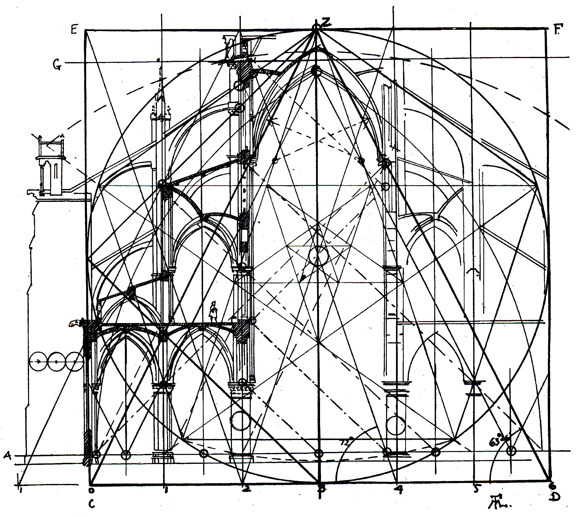
From AD Quadratum by Frederik Macody Lund, published 1919
This kind of work was critiqued by Konrad Hecht in the 1970´s (a German scholar in the field of architectural history), who maintained that it was an example of wishful thinking and not results based on critical observations and reliable data. The articles published by Konrad Hecht put geometric analysis of Gothic architecture in ill repute for decades.
We now know more about how geometry was actually used in design as a result of recent research. Important work has been done by Prof Robert Bork who investigated surviving architectural plans from the Gothic period. He found that pin pricks left in the parchment by the points of the compass and un-inked construction lines could be used to reconstruct the original geometric armatures for the architectural design of cathedrals and abbeys. These results published in “The Geometry of Creation” (Ashgate 2011) demonstrates beyond doubt that geometry was a fundamental tool for the design of Gothic architecture. The geometry is characterized by a beautiful coherence and clarity. The composition has a rhythm with an almost musical quality to it.
The illustration below is an example from “The Geometry of Creation” (Ashgate 2011) of the underlying geometric structure of the facade of Strassbourg cathedral. It is not a hypothetical reconstruction, but shows the actual geometrical components of the design. (illustration is published by kind permission).
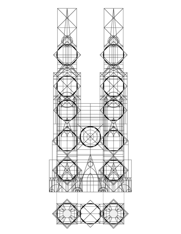
The interaction between the circle, the square and the octagon is commonly used as principles for definition of proportions in medieval geometric design. The equilateral triangle and the pentagon are also important and leads to to different sets of proportions and harmonic cuts.
Geometric proportions of the medieval sword
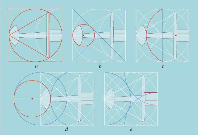
I believe that similar methods were also used in the design of swords. It would have been practical and meaningful to the makers in several ways. It is a practical way to establish specifications for work that is divided between several expert craftsmen, as was the case in the production of swords. Geometric structures are also simple to scale to any size and easy to memorize. That an emblematic power object like the sword should contain intentional levels of meaning from the geometry of its proportions is perhaps not entirely surprising, since its creators lived in a time when the mystical understanding of objects was commonplace. The symbolic meaning embodied by an object or a building may be understood as an important part of its function. The use of geometry in the design of the sword transformed it into a divine instrument, possessed of a perfect wholeness derived from the unity and harmony of its parts.
“…When the parts are arranged in this way, they all combine into the whole; so that out of all the parts in the universe there emerges one single wholeness of things”
Thomas of Aquino, 1225-1274
The igniting spark for this study of geometric principles of design and how they may apply to the shape of the medieval sword was the discovery that the proportions of D 8801 from Søborg followed a simple and coherent geometric structure with small tolerances. Since the summer of 2010 more than 200 swords from different time periods has been analyzed. Especially weapons from the 12th and 13th centuries seems to be based on particularly clear and powerful geometric constructions.
You may read more about how geometry defines the proportions of a medieval sword in the article about the Søborg sword.

I will also return to how the same methods can be used in the design of swords today. To incorporate a design based on geometric proportions in the making of swords is a way to:
Praise the fame and reputation of the old timers,
our forerunners, rule makers, and inventors of this high art
which has its original true basis in the level, set square,
triangle, dividers, and straight edge, and is now pursued
with precision, subtlety, higher understanding
and deeper reckoning.
Hanns Schmuttermayer
Fialenbuchlein ca 1480


